Tackling Crime with Predictive Policing

My contribution and takeaways
Data visualization
Dashboard design
Visual design
User interviews
Problem
Police departments have crime data analysts who create mapping and spatial analysis of crime that aids in crime prediction. The analyzed crime data is used by dispatch officers for planning patrolling duties for officers keeping in consideration available resources like officers and vehicles. However, there was a gap noticed in recent years that prevented efficiency of this system.
Users

Understanding user behavior
After interviewing 35 police officers and shadowing them in their departments, I understood the context of use of the current system.

Identifying themes from user interviews

Not enough time for analysts for adequate crime analysis

Repetitive actions for generating reports

No clear communication with officers
“In a perfect world, we’d have a policeman on every corner, but that’s not realistic with existing resources. I can neither have more budget nor extra personnel. I need to find ways to manage my existing resources well.”
Identifying themes from user interviews
Integrating disparate crime data
Manipulate visual elements in your dashboards without having to recreate the dashboard from scratch
Ability to pull in vast amounts of data into one dashboard
Ability to share dashboards easily through electronic means
Easily create multiple dashboards on the fly

“When there is a 75% or more probability of a crime taking place at a location, I want to make sure that there are enough officers to help prevent it, so that we have lowered crime rates at the end of the month.”
Summary of competitor analysis

User stories


Exploring solutions for user needs

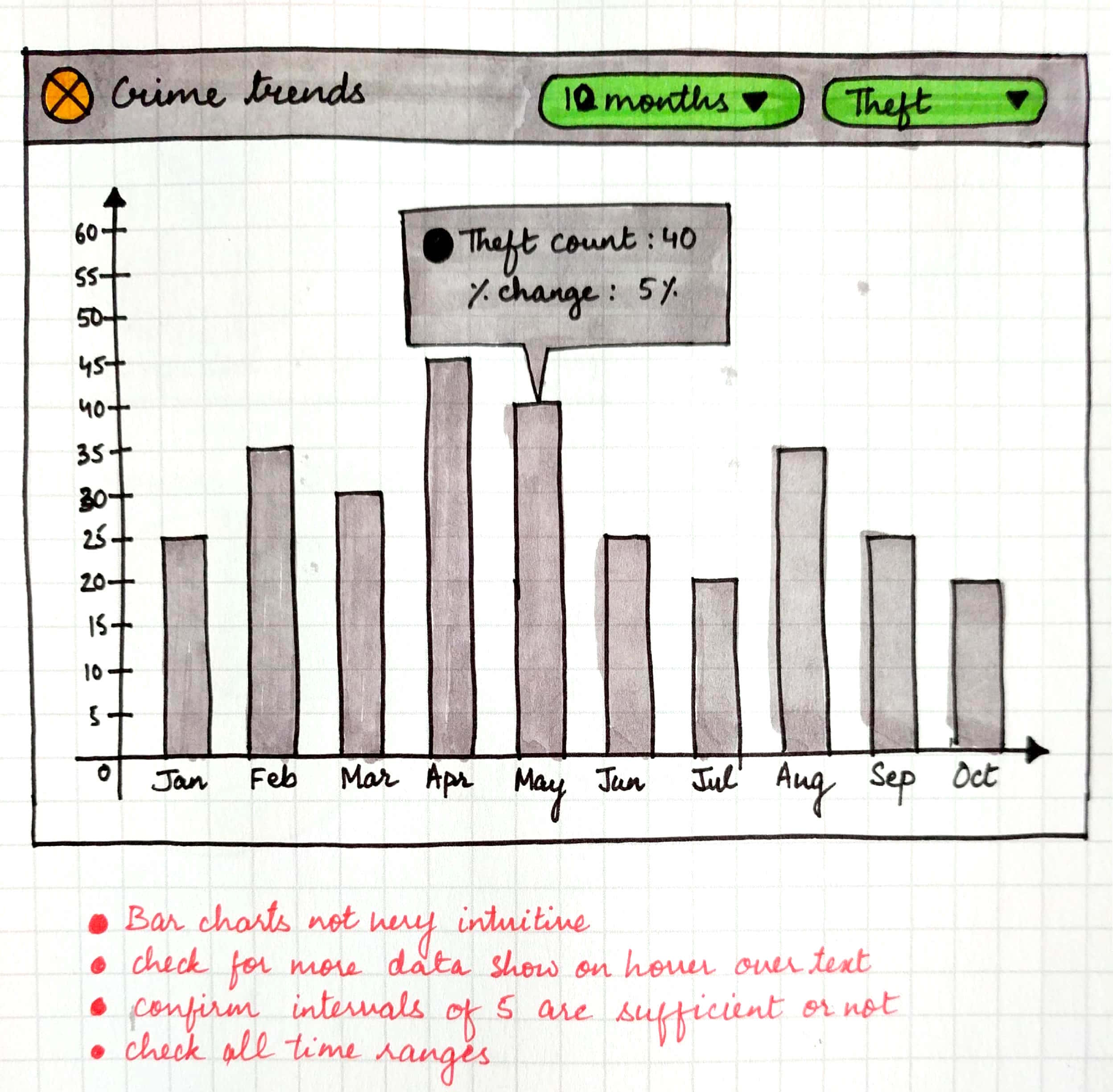
Widget 1 : Crime trends

KPI for historical data

Widget 2 : Daily events aggregation (option 1)

Widget 2 : Daily events aggregation (option 2)

Widget 3 : Neighborhood profiling
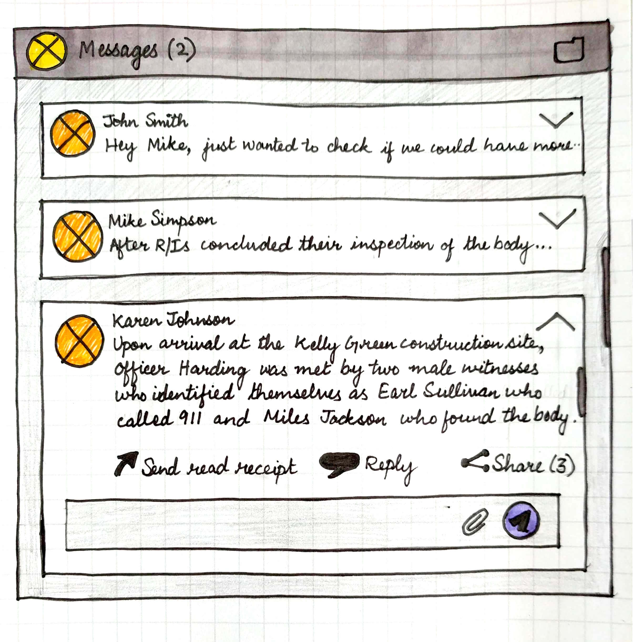
Widget 4 : Messaging
High fidelity prototype
Heatmap designed to show blocks of area where chances of robbery are predicted at in the next week
Heatmap designed to show blocks of area where robbery took place last week
Historical and Predictive crime report dashboard
Scheduler for reports - Adding recipients
Scheduler for reports
Design decisions
Dark color theme


Having 35-40 different crime types, it was necessary to have a varied color palette. Having a dark background would allow more variances in color.
The Dispatch officer monitors the dashboard for 6-7 hours of the day for alerts and real-time data both in the dashboard as well as the map. Therefore, a dark color theme was chosen to minimize digital eye strain.
Line chart instead of bar chart
The crime trends widget required a comparison of two crime types for a selected time range. Having a bar chart with twice the number of bars for each time interval would cause confusion and clutter. On the other hand, line charts are used to track changes over short and long periods. When smaller changes exist, line graphs are better to use than bar graphs. Line graphs can also be used to compare changes over the same period for more than one group.

Choosing Key Performance Metrics (KPIs)
Selecting KPIs was purely based on categorizing different kinds of real time data required for period planning of patrolling duties. Selected KPIs that were more important that others were:
number of CAD calls
upcoming events
suspicious activities reported
criminal activities by timeline categorized into
property related crimes
violent crimes
quality of life crimes.

Exploring layout of each KPI to show the most relevant information


Empty states
Empty states were designed to indicate the status of the system at every point. Feedback presented while onboarding kept the user updated about the status of the system and informed about what to expect in the next few steps.
Snapshots of main widgets' empty states. Call-to-action texts were chosen to encourage users to choose a different date, time range, or set up an email for the first time.

Sharing
Each widget can be shared with individuals or groups within the department. A scheduler helps the officer create reports to be sent automatically to intended group of recipients.
Collaboration
An additional messaging widget was designed to quickly pass information to and fro without exiting the dashboard.
Impact

Robbery reduced by 7.7 percent with more tactical information like crime locations, time of the day and day of the week.
(Based on data collected from November 2017- April 2018)

Directed, actionable patrol plans (Carjacking is down by 67% as of April 2018)


Increased resource efficiency due to directed patrols based on crime type
Increased communication and collaboration between frontline officers and analysis team
“The Crime module in Hitachi Visualization Suite provides us with data that gives our officers a purpose to be out on the street. They are no longer randomly assigned, but are deployed with a mission. ”
Testimonial
“Soumya has a strong understanding of dashboard design process and is able to clearly convey tie her designs to UX principles. Her paper prototypes reflect novel ideas and are insightful. She has a wonderful personality and is fun to work with. ”