Individual contribution and takeaways
- information architecture
- visual design
- mobile app design
- creating infographics
“Soumya was easy to work with and an excellent team player. As a company partner to her graduate program, I saw the great effort she put into understanding my company’s industry and designing the next gen experience of our mobile app over the course of 6 months. Her attention to the “why” behind her design decisions was refreshing and she was always receptive of feedback. I think she would be an asset to any team.”
Problem

Insight into user behavior

Emerging themes
- Applications need to be built for tablets as well as small handheld devices.
- Many people’s initial reason for downloading the app was for the digital ID card.
Market segment analysis


Functional requirements
- Users can log into the app to view their healthcare information
- Users can access their Insurance ID card
- Users can manage claims for all the members in their healthcare plan
- Users can find doctors and specialists
- Users can contact doctors
- Healthx can add integrations and modify the application to suit the needs of individual Payers and healthcare Provider
Information Architecture
Certain features like Account Overview and the ID Card are present higher up, representing that they are a part of the top-level navigation. The yellow fields indicate that these menu items will be spots for integrating various third-party services.
Key features
- The Healthx mobile application would allow users to track their deductible and HSA/FSA accounts, track claims for all the members on the plan, view and request new ID cards, find doctors based on their specific requirements, and communicate with their primary care physicians via a secure messaging service.
- When users log into the application, they are greeted with a main screen that shows their deductible information in a graphical format using a donut chart. A tab view is used to show the various categories of their health plan, i.e. Medical, Dental, and Vision. The claims history is also shown in a tabbed layout.
- Hamburger-style navigation is used to access the various sections of the application. The app user can access any of the aforementioned features of the application via these menu items.
Wireframing


Summary of product assessment
- Complex Terminology and Jargon
- Confusing Navigation
- Confusing Messaging Feature
Card sorting

High fidelity prototype


Key Takeaways

Lostness calculator
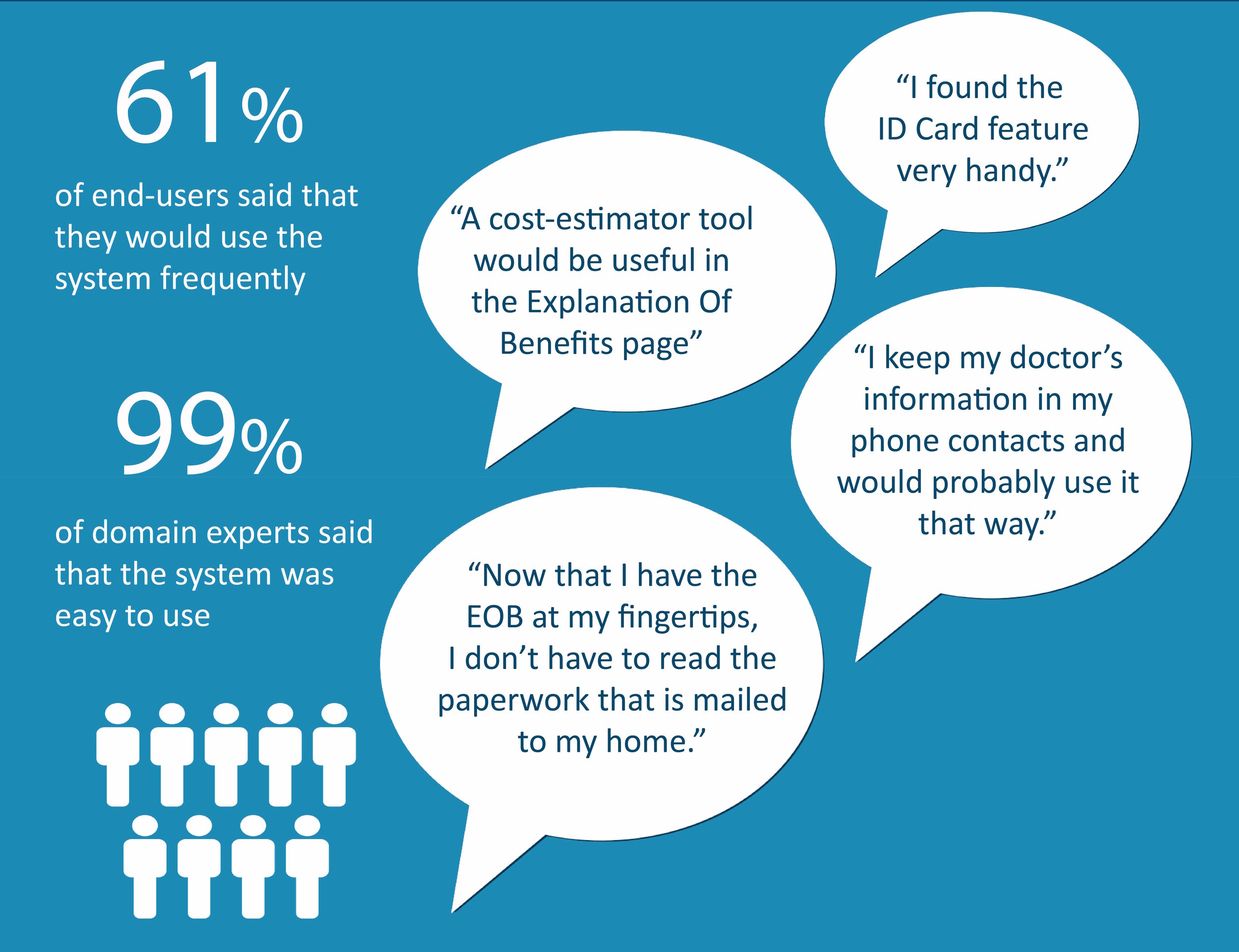
- The Average SUS score across all participants was 81.5.
- Participants had very positive feedback about the ID card feature.
- Lostness calculations also mirrored some observations.
- A more detailed view of claims history was desired.
- The donut chart view was received well overall, with the main feedback being that the chart should be annotated with more data
- The find menu item was universally confusing, as it implied a global search within the app.
Next iteration
- Fixed menu added for bottom navigation. It consists of three buttons- Pay a claim, Send a message, ID Card
- Added deductible label above Donut chart
- Changed main menu item Finder to 'Find a service'
- Changed position of buttons for 'Find a Doctor' and 'Find a Pharmacy'
Outcome
For details on design process, explorations and iterations, feel free to reach out to me.
Other selected projects

Tackling crime with predictive policing
Data visualization Visual design, Dashboard design

Protecting the innocent with video redaction
Interaction design, Product design, Computer vision

Preventing harmful drug interactions
Usability testing using eye tracking, Visual design, Experience design