Investigating Alerts with an AI-powered Swiss Army Knife

Investigation workflow

Lacespace - the AI companion

My role
As the lead product designer in this project, I worked on defining what the overall experience would look like. I also planned milestones and ensured an incremental change without affecting users’ mental models.
For this project, I had to coordinate with an unusually large number of cross-functional partners since my role was front and center of the design team. I collaborated with PMs from feature teams, designers, developers, platform developers, data scientists, and the customer success team.

Customer base
For this project, we were targeting a customer base consisting of 3 personas. The primary personas were the Security analyst and the Architects, who are responsible for fixing issues and monitoring the security ecosystem, therefore are more hands-on with the product

The User problem
Wasted time
Each feature had a different experience leading to confusion. Users had to open too many tabs to get to a resource/ tool and often lost the context of where they came from
Confusing navigation
Users didn’t have enough information and tools to perform the actions they needed to
Users had to go out of the main page to find key information
The Business problem
Customers brought up issues in the current Lacework UI. The recurring theme around usability issues were Discoverability and Consistency hence wasting a lot of time.
Additionally, customer support was flooded with complaints where the underlying theme was the inability to find tools and resources in the UI.
Low renewal rate
The renewal rate was at an all-time low of 40%
High customer support costs
Having ongoing support was getting expensive
A big chunk of the tickets alluded to usability issues at the platform level
Breaking down the problem
Breaking down the problem into four categories:

Information density - Users have to go to several different tabs to gather information
Accessible tools - Users have to go through several layers to access tools
Help - Users have to go to a separate documentation site to get help
Actions - Actions pertaining to an alert are buried under several layers of information.
Leveraging existing research
“If I didn’t have to go to several different pages, be able to take actions, and provide updates to my team all from a single source, it would cut down my process time by 80%”
Getting into the customer’s shoes
After defining the main goal and aligning requirements from leadership, I realized that there were way too many pain points to address. Additionally patching up parts of the experience won’t resolve the main problem. Therefore, we realized that the platform was in dire need of an experience overhaul.
Understanding basic user flows

Focusing on features goals
Although our brief was to develop a better end-to-end workflow than our competitors, we stressed that engaging in a feature parity war was neither strategic nor had the best interests of the users of the platform at heart.
To differentiate our platform in an already mature and competitive market in cybersecurity, we needed to define a simple, straightforward, and desirable experience for the platform and how it would meet the users' needs.

Criteria to measure success

I crafted 183 micro-conversion criteria in collaboration with feature designers, UXRs, Data Scientists, and PMs.
Micro conversion acts as a process milestone in the conversion funnel and impacts the ultimate step or macro conversion.
Full story was used to check rage clicks, and error rates and define quantifiable metrics for these micro conversions that eventually would help define the macro conversion rate.
Design principles
Actions, tools should be easy to find
Ensuring the user has context on what’s going on at all times
The solution must eventually lead to reduced time on task
Bringing on so much information might lead to a cluttered UI, so I strictly let the user discover information in a flow

Design explorations

The first exploration was a left panel The idea was since the user reads from left to right, they would find the summary beneficial before the actual data.
This tanked when we tested it because users found it distracting and ended up closing the panel before proceeding with interacting with the page

Next was a preview panel that would overlay on the UI invoked with a right click.
While this worked for a majority of features, this didn’t work for graph-based content because it overlapped on contextual real estate.

Another was a slide-up menu that was excellent in showing graphical representations
While this helped get comparative information for certain use cases, the usage of this panel was limited to the amount of information it could contain.

The right panel seemed to check all the boxes. The position of this panel was decided keepin in mind not to encroach on the foveal area of the screen that displays the primary information even for wide screens, learning lessons from the research conducted previously

I created a skeletal structure for each content type to have a logical flow of constructing a story before making a decision

I then laid out information in terms of their priority and identified levels of information in terms of their usage and relevance
I gathered 18 use cases for primary information, 13 for secondary, and 4 use cases for tertiary
Primary - The most important information the user needed to know immediately
Secondary - User research showed this info was sometimes important to triage or fix a vulnerability
Tertiary - Limited usage with specific types of alerts

Unifying content types
Some of the unique card patterns were the visualizations, attack path, and Lacespace.


Iterating on details


Each card within the panel went through a series of iterations
I also injected AI recommendations to help the user fix these types of alerts.

Minimize dead ends and context switches
Our key priority was to focus on the primary user goals - retaining context throughout the whole investigation experience. I made the content cards more powerful by adding a preview on hover so the user knows if they would be redirected to a new tab.
Additionally, I included basic actions on content cards to help aid their workflows


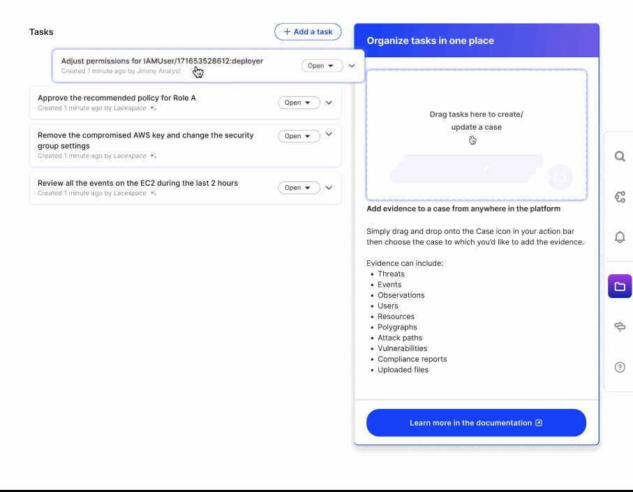
Organizing the Arsenal
It was important for the user to find everything pertaining to the alert in one place. So I included a drag and drop functionality for them to organize pieces of evidence in a single repository accessible from the toolbar.
Designing for Scale
Entities pertaining to an alert could have multiple instances and it was important to keep those edge cases in mind. So I went through several iterations to include all possible scalability use cases.

Amplify the Experience with an AI Companion
Focusing on when users would like handholding, Lacespace would provide users with answers they are looking for, provide recommendations, and even make decisions based on past user behavior
Lacespace - An extended experience

Enhancing the Investigation Flow
Lacespace, the AI companion will help with triaging an issue, answering questions about the data, organizing actions to be taken, provide clarifying information and assigning issues to specific teams to fix.

Design Principles for Designing an AI Assistant

Ensuring we onboard the user with concise tasks was the goal. The smaller the task, the more accurate the outcome
Ensuring the user always has control and can veto decisions
Feedback at every step was crucial so the user knows what’s happening. Sometimes when recommendations are shown, the user must have the rationale why this was shown.
We also collect micro and macro level feedback from the user after each interaction with Lacespace
Intent of the user should be clear to the system at every level so we don’t stray away.
How do we measure the Success of the AI Assistant?

Guardrails for microconversions were defined for certain criteria like how many users accessed the recommended queries. If the number is less than 18%, then we rollback the feature.
Since we were using transformers, a model where labeling the whole dataset is not required at once to train the large language models, I wanted to ensure we take it micro steps as the user fully onboards.
Trade-offs

Since we deployed transformers - a model where all of the data need not be labeled at once to train the Large Language Models, it was important for us to convey to our users that the recommendations for the initial 45000 alerts would not be as accurate as intended as the system is still learning.
Speed versus Consistency
One of the major trade-offs in this project was waiting for alignment from all feature teams versus releasing to a select few feature-specific customers. Getting alignment took a long time, but it was important to have a unified experience across the platform
Revisiting the Problem

Impact


Design time on average was reduced by 30% as we had dedicated UI components. This translated to a 45% reduction in development time as well.
The average perceived satisfaction score was 70%, meaning users felt more comfortable using the new navigation patterns.
Most users felt comfortable using Lacespace and provided valuable feedback and insights as they continued using the assistant.
We met 71% of the 183 micro conversion criteria defined that funneled towards the macro conversion metrics.


Beyond Impact
Although not a part of the project, I took this up as a passion project and created a new look and feel of the UI and updated the design language system
Consistent feedback received by feature teams for feature requests. Customers felt comfortable communicating feedback as they felt listened to. Additionally, customers showed greater confidence in Lacespace as it was closer to their actual workflow.
Other OKRs were met due to this overhaul like reducing the number of false positive alerts - as the user uses the platform, the system learns from their behavior and produces more accurate results